Open your messaging app, and you’re holding a pocket alphabet of feelings. Now imagine tiling those tiny symbols into a stadium-sized story. That’s the delight of emoji murals: micro icons building macro narratives. In a feed where everything fights for a blink, a wall of 🍋💡🌊🔧 reads like a comic strip you can decode at a glance.
To prototype these mosaics, I love sketching the big idea with an AI photo generator first, then refining the tiles into a system you can scale. And yes, Dreamina AI image generator helps us go from “cute grid” to “campaign that sings.”
From chat to wall: how a handful of pixels earns a billboard
Murals need emojis to be large and precise, but emojis were intended to be small and general. The trick is to tell a story in two planes at once: the macro scene (from five meters away) and the micro payoff (from a swipe’s distance). You want a reveal, like realizing a portrait is actually 900 tiny umbrellas.
- Macro read: one bold composition—heart-shaped coastline, rocket launch, city skyline at dusk.
- Micro read: clusters of handpicked emoji that add surprise, humor, and brand cues.
- Continuity: repeating motifs (three stars, a ribbon, a droplet) that guide the eye like breadcrumbs.
Curating your emoji palette without losing the plot
All emojis are not created equal at billboard scale. Some have hard edges and read clearly; others blur into ambiguity. Curate like a museum director.
- Favor geometric or high-contrast icons (🧊, 🎯, 🧱, ⛰️) to build structure.
- Keep delicate or intricate emoji (🦋, 🍜) for borders, accents, or “hidden jokes.”
- Establish a brand triad (e.g., blue, coral, cream) and prioritize emojis that sit comfortably in that palette.
- Limit yourself to 12–18 core emoji so the system feels intentional.
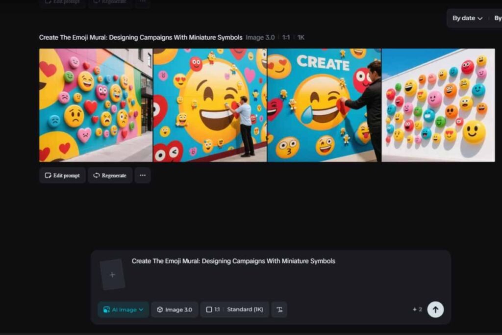
The emoji atelier: crafting your mural’s hero frame with Dreamina
When your mosaic must read in one blink, it helps to lock the hero frame early. Dreamina can help you visualize the big picture, test color flows, and prep assets before you place a single tile.
Step 1: Write a text description
Go to Dreamina and state the macro narrative and atmosphere, along with what emoji sets you’ll employ.
Example prompt: “A big heart-shaped seaside skyline at dusk, made up of small emoji tiles (waves, shells, anchors, stars), high contrast, warm coral-to-indigo gradient, negative space saved top-right for headline, playful but high-end appearance.”
Step 2: Tune parameters and generate
Depending on how much cropping room you’ll need, choose a model that manages crisp edges well, configure the aspect ratio to fit your placement (for example, 4:5 for posters or 9:16 for vertical walls), pick a size, and then decide between 1k and 2k resolution. Click Dreamina’s symbol and choose the one with the sharpest silhouette to make variants.
Step 3: Personalize and download
To make the macro form truly stand out, use Dreamina’s AI customisation to retouch borders, remove distracting artefacts, expand the canvas for bleed removal, and inpaint gaps. When it’s tight, click on the “Download” icon and save your master frame for layout and motion tests.
Narrative by numbers: mapping beats to clusters
Emoji murals thrive when the viewer can track a storyline across the composition. Assign emotions to patches by adopting the mindset of a storyboard artist:
- Inciting spark: 🔦, 💡, ⚡
- Obstacle or tension: 🌧️, 🧩, ⛓️
- Momentum: 🛼, 🚲, ⏩
- Resolution: 🫶, 🌅, 🎉
Arrange these in arcs that sweep left-to-right or bottom-to-top. People instinctively follow motion and gradients—use that bias.
The golden eggs that reward the inquisitive are the hidden wink
The mural’s charm lives in little secrets. Sprinkle a few inside jokes for superfans (two tiny 🥑 hiding in a green hillside; a 🎧 tucked into the skyline for a music collab). Place them where the eye resting points are—corners, intersections, or the negative space near headlines.
Prototyping scale in a small room
Before you rent a wall, test legibility on a phone. Can a stranger read the macro form in a single second if you zoom your layout down to 320 pixels wide? If not, make clusters simpler and contrast them more. Convert the image to grayscale, too; if the structure collapses, you’re leaning too hard on color.
Where emoji murals truly shine
- Launch teasers: reveal the product silhouette formed by thematic emoji (for a hydration brand, think 🚰💧🫙).
- Wayfinding & events: guide attendees via living maps (“Follow the 🍊 to stage B”).
- Cause collabs: visualize impact (trees made from 🤝 + 🌱).
- Education: build diagrams students want to screenshot.
If you’re also designing motion stings or app icons, spin up quick badge tests in Dreamina’s AI logo generator to see how your emoji clusters compress into crisp, versatile marks. You’ll spot which ingredients survive at favicon size.
Production tips that save headaches later
- Grid first, grace later: start on a strict grid; relax a few clusters for organic character.
- Edge control: outline the macro silhouette with sturdier emoji (🔷, 🧱) so the shape stays crisp at distance.
- Depth cue: darker emoji low-left, lighter high-right—instant faux lighting for dimension.
- Copy placement: reserve clean blocks; don’t force type over noisy clusters.
Extend the mural beyond the wall
Campaigns live longer when pieces travel. Turn “hero clusters” into buttons, magnets, patches, and yes—portable decals. A savvy sticker maker can output sheets where each cluster becomes its own collectible. Suddenly, the mural fractures into sharable tokens that keep retelling your story on laptops and water bottles.
Turning still mosaics into motion moments
Static layouts are lovely; motion makes them memorable. Animate subtle “pulse” behaviors: stars twinkle, waves ebb, leaves sway. Keep it gentle—micro-movements at 5–8% amplitude so the mural doesn’t become jittery. Consider a reveal where the macro image coalesces from a scatter of emoji, then holds steady while a headline fades in.
Headlines that play nice with pictograms
Type must coexist with mini-icons without a custody battle. Choose simple, friendly faces that won’t compete with emoji personality. Short, rhythmic lines (“Make tiny. Think massive.”) break cleanly across the negative space you reserved earlier. If you’re designing multilingual campaigns, emojis become the constant—your typographic “translation layer” slots in around them.
Measuring delight without reducing it
Tally more than clicks. Emoji murals generate saves, re-posts, and IRL photos. Track:
- Macro clarity score: A/B test silhouettes to determine which one new viewers can recognise the quickest.
- Egg discovery rate: how many comments mention hidden elements.
- Spin-off adoption: usage of sticker clusters in the wild.
- Dwell time: longer pauses on vertical video versions quantify “decode pleasure.”
Pitfalls (and graceful detours)
- Too many emoji: the eye tires. Reduce palette; amplify contrast.
- Over-reliance on yellow faces: they flatten into one note. Introduce items and shapes to provide structure.
- No breathing room: set apart areas that are quiet; murals require time to read.
Set three anchors and allow everything to revolve around them to create colour chaos.
Closing the loop: small tiles, enormous emotions
Emoji murals serve as a reminder that while one icon can whisper, a million can roar, demonstrating the reciprocal nature of communication. When you architect a clean macro silhouette, curate a disciplined micro palette, and prototype the whole in Dreamina, you get a campaign that rewards a glance and a stare.
And when those clusters leap from walls to feed posts to backpacks, your story keeps recombining in the wild. Tiny pictures, big resonance—Dreamina helps you tile it all together, one delighted pixel at a time.